What’s better: making your audience read yet another slide full of bullet points or saving them the trouble by graphically showing what you’re talking about?
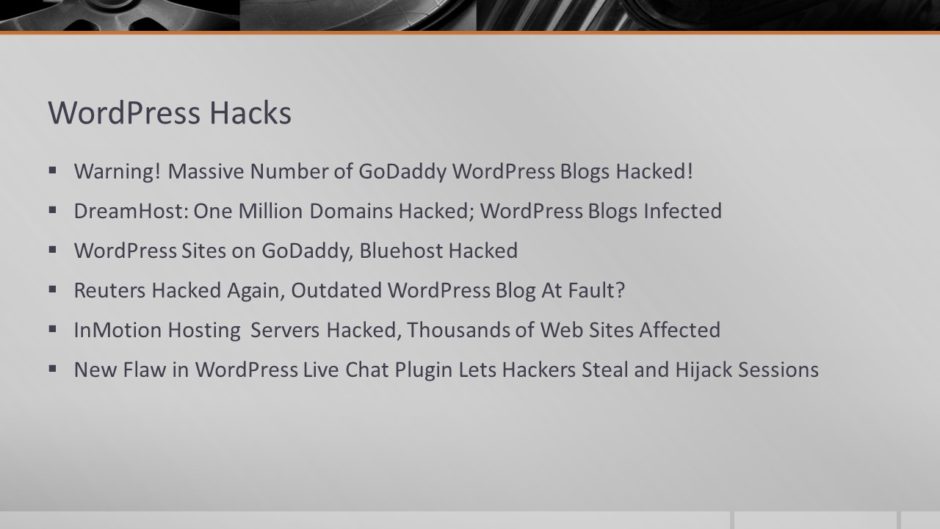
Before: Bullet points OK!

This slide is presenting information about about different WordPress security breaches across multiple servers. This slide has too much text, and it all comes up at once, meaning that the audience has to read along while the presenter talks. That’s not good, because if the audience is reading, they’re not paying attention to the presenter.
These all looked like headlines to me, and a quick Web search confirmed it. That immediately suggested a graphic treatment to me.
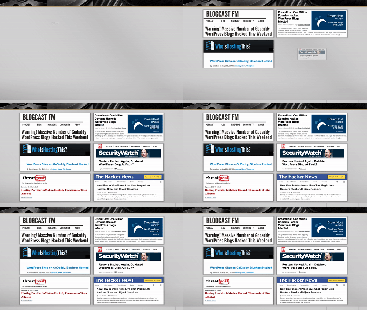
After: Screen shots authenticate the message

Since we’re going for graphic impact, I searched the Web for instances of each bullet-pointed phrase then took screen shots of each article I found. The screen shots illustrate the fact that these are real headlines appearing on real websites. And animating the screen shots with the Zoom effect adds drama!
The Takeaway
The main message of the slide is that WordPress hacks are taking place. So the audience doesn’t need to read and understand each headline in depth. What’s more important is showing people, graphically, that these breaches happened and that they’re making the news.
