Sometimes, it’s all about the numbers. How you show them can mean the difference between “So what?” and “Wow!!!”
Before

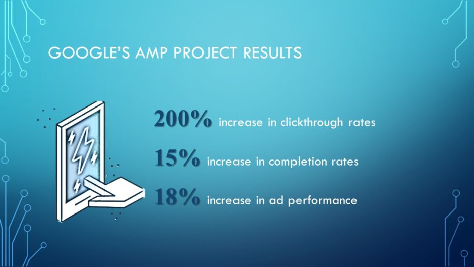
On this slide we can see that there are some good results from using Google’s AMP Project. But we have to work for it.
Problem 1: Listing numbers instead of showing them
The numbers are presented in list form in no particular order. We have to read each line to determine what’s going on. “Data visualization” means to present data in a visual way so that the audience doesn’t necessarily have to read the words to get an overall impression of what the numbers mean.
Problem 2: No source given
For all the audience knows, the presenter just made up the numbers. Without a credible source, the audience is left to guess.
Problem 3: Clip art
Are we still using clip art like this? No. No, we’re not.
Problem 4: Old-timey typeface
When PowerPoint came out in 1990, Times New Roman was the default typeface for headings. Using it now makes slides look dated.
After

Solution 1: Data visualization
I have reordered the statistics from lowest percentage to highest, left to right, and presented them as a modified column chart. There’s no setting for pointy columns, so I just created a dummy chart, drew the pointy shape over the columns then deleted the chart. I made the pointy shapes transparent so that people could still see the photo beneath them. Now that the data are presented as a familiar column chart, it’s easy to compare the data points and see at a glance that there is a higher percentage increase in clickthrough rates than there are in completion rates and ad performance.
The animation above is cycling through fairly quickly, but the speed can be adjusted by the presenter depending on how much time she spends on each data point.
Solution 2
When presenting statistics, especially dramatic ones like the 200% increase in clickthrough rates, it’s important to cite the source. A great way to do that is to use a free online tool called the Citation Machine where you can choose the citation style, specify the media type, etc. When I cited the Web page where I got the data, the Citation Machine gave me a very long URL, which I shortened with Tiny.cc so that the citation would fit on one line. And I chose to use light-colored text over a transparent dark background to make the citation visible over the varied tones of the photo.
Solution 3
Of course, you knew this slide needed a photo! Using an awesome, free PowerPoint add-in called Pickit, I quickly located a photo of people using their smartphones to liven up this slide.
Solution 4
I used the typeface that came standard with the template and voila! No more Times New Roman.
In conclusion…
People shouldn’t have to read text to derive meaning from numbers. Presenting data visually so that people can immediately figure out what they mean helps you to quickly communicate with your audience.
[button link=”https://www.lauramfoley.com/gallery-2/” color=”orange” target=”_self” size=”small” title=”Back to Gallery”]Back to Gallery[/button]
[divider style=”shadow”]
Submit your own slide for a Makeover!
If you subscribe to the Cheating Death by PowerPoint newsletter you can receive a free Slide makeover! Here’s the deal: In exchange for permission to use your slide in the newsletter and on this website for promotional purposes, you’ll get the redesigned PowerPoint slide file to use in any way you like. So not only do you get access to a step-by-step video on how the slide was redesigned and the source file, you learn the reasons behind all of the changes!
You’ll also get a free eBook, Cheating Death by PowerPoint: Essential PowerPoint Tips, Tricks, and Best Practices, which includes loads of advice on how to improve the way you work with PowerPoint!
[button link=”https://list.robly.com/subscribe?a=c4115aa351a8e513f6e3b7af8ffaf943″ color=”default” target=”_blank” size=”small”]Subscribe to the Cheating Death by PowerPoint newsletter[/button]
[divider style=”shadow”]
[button link=”#top” color=”gray” target=”_self” size=”small” title=”Back to top”]Back to top[/button]

