Presenters refer to some overly busy slides as “eye charts.” The implication is that they’re in the deck because for some reason or another somebody said at one time that the information had to be in the presentation, and the speaker doesn’t like it but does as he’s told.
Pfft! That’s lame.
Every slide in the deck needs to further the goals of the speaker. If a busy slide isn’t working for you, then show it who’s boss and change it so it does.
Before

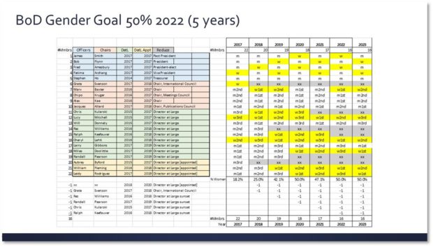
Here’s a slide that packs a lot of information into a limited space. You’ll probably need to zoom in on it to get all of the details. Don’t worry; I’ll wait.
The main message of this slide is supposed to be that by 2022 the number of women who serve as officers and on the Board of Directors will increase. Right now, that information is buried.
Problem 1: Colors aren’t very helpful
Colors can be used to call out important information or separate things into groups. On this slide, the colors on the left side represent the different roles within the organization. The yellow boxes on the right represent the roles filled by females and the grey boxes indicate where roles have been eliminated, but there isn’t much contrast against the white background. Overall, you can’t tell at a glance what the colors mean.
Problem 2: TMI
In the lower left-hand corner is a list of the individuals who will be leaving their positions. This is the same information we get from looking at the grey boxes. On the right side, the number of members is duplicated at the top and bottom of the table.
Problem 3: This slide is sooooooo confusing!
The title only refers to the gender goals of the Board of Directors, but the table references the officers. The text in the table on the right is very confusing. I get that “m” means “male” and “w” means “woman,” but what the heck do “m1st,” “w2nd” and “m3rd” mean? And the way the colors and lines are set, it looks like four separate tables on the same slide.
After

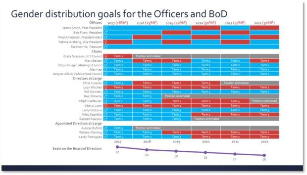
This redesigned slide is still an eye chart, but what a difference! By consolidating the information and using bold colors, viewers get a big-picture message at a glance and more detail as they look more closely. Ideally, of course, the presenter would spend some time walking the audience through this slide, but if not then the color blocks and line chart tell the story quickly.
Solution 1: Make the colors matter
Men are blue, women are red, and grey is “position eliminated.” With a three-color system in the table, it’s easy to see at a glance what the gender distribution is. I removed the color-coded position table, which was distracting, instead opting for grey text.
Solution 2: Consolidate
Rather than calling out the positions as different colors and repeating titles, I added a title above the names to differentiate the groups and eliminate the repetition. This took up a lot less space, which I devoted to the gender distribution part of the table. I removed the lower part of the table that showed which positions were being eliminated because that’s the purpose of the grey boxes.
Solution 3: New title and captions
The title now encompasses gender distribution across the officers and the Board of Directors. I was able to delete the labels for the “male,” “female” and “position eliminated” cells because the colors tell the story. And I changed cells like “m1st” to a blue cell with “Term 1,” “w2nd” to a red cell with “Term 2,” etc.
In conclusion…
Tables can be confusing for your audience, but if they must be included in a presentation then make sure that they communicate valuable information both at a glance and upon further study.
[button link=”https://www.lauramfoley.com/gallery-2/” color=”orange” target=”_self” size=”small” title=”Back to Gallery”]Back to Gallery[/button]
[divider style=”shadow”]
Submit your own slide for a Makeover!
If you subscribe to the Cheating Death by PowerPoint newsletter you can receive a free Slide makeover! Here’s the deal: In exchange for permission to use your slide in the newsletter and on this website for promotional purposes, you’ll get the redesigned PowerPoint slide file to use in any way you like. So not only do you get access to a step-by-step video on how the slide was redesigned and the source file, you learn the reasons behind all of the changes!
You’ll also get a free eBook, Cheating Death by PowerPoint: Essential PowerPoint Tips, Tricks, and Best Practices, which includes loads of advice on how to improve the way you work with PowerPoint!
[button link=”https://list.robly.com/subscribe?a=c4115aa351a8e513f6e3b7af8ffaf943″ color=”default” target=”_blank” size=”small”]Subscribe to the Cheating Death by PowerPoint newsletter[/button]
[divider style=”shadow”]
[button link=”#top” color=”gray” target=”_self” size=”small” title=”Back to top”]Back to top[/button]

