National Geographic is famous for its stunning photography and beautiful data visualization. But a photo in this month’s issue confuses readers because while it’s styled beautifully it sends mixed messages about the data it represents.
Before
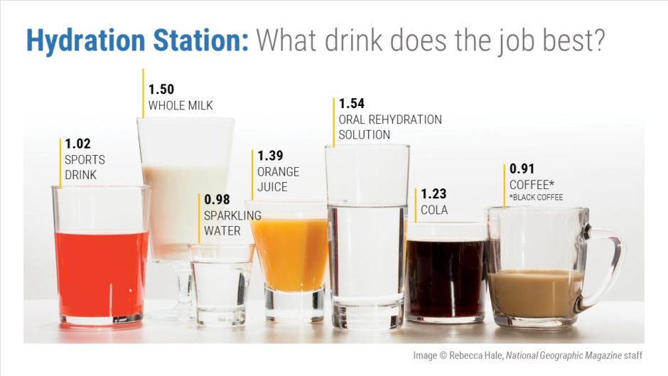
Will you look at this gorgeous photo! It’s from an article in the April 2017 edition of National Geographic, “These Surprising Drinks Are the Best Thirst-Quenchers,” that describes how various beverages compare to water when it comes to hydration. The baseline is 1.0 for plain water. Beverages with higher numbers hydrate better and those with lower numbers hydrate less well.
Problem 1: Out of order
This photo is meant to be a stylized column chart. The language of graphs is that we usually start with a number on the left that either increases or decreases as you move toward the right, which makes it easier to see the extremes (e.g., highest/lowest, most/least). In this image, the order is random so you have to read the captions to learn how each beverage compares to the rest. I don’t have time to read all of those captions, do you?
Problem 2: Levels aren’t lining up
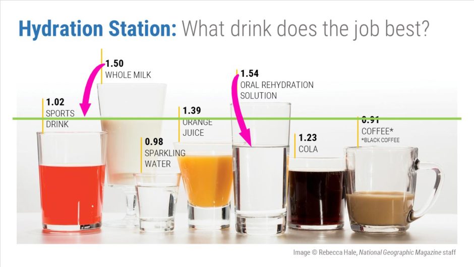
A quick glance at the photo might lead one to believe that milk has the highest hydration rating. In fact, it’s only the second highest. Why the confusion? The milk is in a stemmed glass which raises its level above that of the oral rehydration solution, which has the highest rating. There’s a similar problem with comparing the sports drink and the cola; although cola rates higher its level is slightly lower than that of the sports drink.
Problem 3: Conflicting information
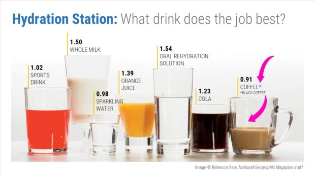
The photo shows a cup of coffee with cream, but the rating is for black coffee. Rather than scrap the photo and reshoot, they decided to just add an asterisk and put the footnote right beneath it. This is a major kludge! C’mon, National Geographic!
After
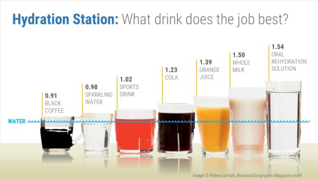
Full disclosure: My photo composition is a complete hack job. I didn’t spend too much time on it, because nothing challenges a retouching artist like isolating glass shapes and re-creating reflections and transparency. The correct way to fix this photo would be to set it up again and reshoot. I just wanted to do a down-and-dirty job with it so that you could visualize what I’m talking about.
Solution 1: Reorder the glasses, lowest to highest
Now it’s easy to see that coffee has the lowest rating and oral rehydration solution has the highest. I added the baseline for water to show how the levels of the different beverages compare. I also ensured that the captions are stepped so that they’re consistent with the beverage levels.
Solution 2: Made the glasses more uniform
Through the magic of photo manipulation, I removed the stem on the milk glass and distorted the shapes of each glass to make the liquid levels consistent with the captions and the bottoms of the “columns” more or less the same.
Solution 3: Removed extra information
The first beverage is now black coffee, so there’s no need for a footnote.
In conclusion…
Using photos of real objects is a great way to visually depict data. But we need to remain true to the language of charts; the data need to be presented consistently so that we can compare them. With too many variables, the original photo just wasn’t doing a good job of visualizing the data.
[button link=”https://www.lauramfoley.com/gallery-2/” color=”orange” target=”_self” size=”small” title=”Back to Gallery”]Back to Gallery[/button]
[divider style=”shadow”]
Submit your own slide for a Makeover!
If you subscribe to the Cheating Death by PowerPoint newsletter you can receive a free Slide makeover! Here’s the deal: In exchange for permission to use your slide in the newsletter and on this website for promotional purposes, you’ll get the redesigned PowerPoint slide file to use in any way you like. So not only do you get access to a step-by-step video on how the slide was redesigned and the source file, you learn the reasons behind all of the changes!
You’ll also get a free eBook, Cheating Death by PowerPoint: Essential PowerPoint Tips, Tricks, and Best Practices, which includes loads of advice on how to improve the way you work with PowerPoint!
[button link=”https://list.robly.com/subscribe?a=c4115aa351a8e513f6e3b7af8ffaf943″ color=”default” target=”_blank” size=”small”]Subscribe to the Cheating Death by PowerPoint newsletter[/button]
[divider style=”shadow”]
[button link=”#top” color=”gray” target=”_self” size=”small” title=”Back to top”]Back to top[/button]
