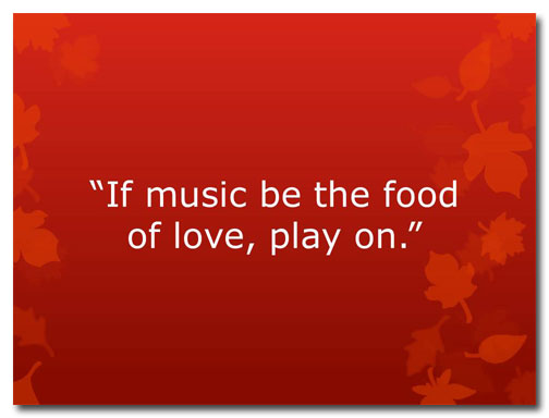
With February comes Valentine’s Day so I thought I’d draw inspiration from William Shakespeare to address a common problem in slide layout: How do you format a quotation?
Before
Snore.
Apart from the pleasant background color and graphics, this quotation is about as florid as a wet dishrag. This font, Verdana, works well when you’re after a clean, corporate look, but it’s a total flop when used for this particular quotation. I think that this slide could really benefit from a picture, don’t you?
After
Now we’re talkin’!
The addition of the violin and sheet music evoke feelings of romance and beauty and speak directly to the words in the quotation. I’ve also used a more playful font.
Look how I can change the mood by using a different image and font:
It’s not likely that you’ll have to illustrate Shakespeare any time soon, but you can use these ideas the next time you include quotes in your presentations. You could use a picture of the person you’re quoting or images suggested by the quote. And play around with how the type is positioned; for this style you want to break away from the template, if just for a little while.


