This will be a short post today because the topic is very simple: silence your cell phone when you're in a meeting. Especially if you're running it. Every mistake is a learning opportunity. Or, if you make the mistake while you're teaching people how to be good presenters, a teachable moment. In … [Read more...] about Don’t be that guy whose cell phone rings during a meeting
How can we learn from Michael Bay’s CES blunder?
To say that the Consumer Electronics Show, or CES, is an electronics and technology trade show is like saying that a 1954 Château Lafite Rothschild is a bottle of wine. It is that and so much more. It is a huge deal and presenters who are introducing new products do whatever it takes to make a great … [Read more...] about How can we learn from Michael Bay’s CES blunder?
Presenting at trade shows: problems and solutions
The Small Business Expo—a business networking event, trade show, and conference for business professionals—was held in mid-October in Boston, Massachusetts. Among the many offerings at the SBE were numerous workshops designed to provide valuable business skills. The workshop I attended was being … [Read more...] about Presenting at trade shows: problems and solutions
Do you need header and footer blocks on PowerPoint slides? No.
We see it all the time—a slide that has a large, colored bar along the top for the title and another one along the bottom for a logo, page number, and various other footer items. Why has this become the norm? It's true that many of the templates that come standard with PowerPoint use this … [Read more...] about Do you need header and footer blocks on PowerPoint slides? No.
How to royally screw up a PowerPoint presentation
Here is a transcript from a horrible presentation made by rookie presenter, Joe Fumbler. In August 2012, I conducted a contest exclusively for Design Dispatch readers to find all the flubs made by Joe Fumbler during his presentation, and reader Robbie Kularski came up with eighteen mistakes! … [Read more...] about How to royally screw up a PowerPoint presentation
Do you read your PowerPoint slides to the audience? Knock it off!
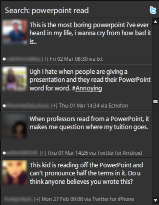
According to a recent survey conducted by PowerPoint designer Dave Paradi, the number-one PowerPoint annoyance is when presenters read their slides to the audience. In fact, "reading from the slides" has been one of the top five most annoying PowerPoint habits since he started conducting this survey … [Read more...] about Do you read your PowerPoint slides to the audience? Knock it off!
How do you show bad news in PowerPoint?
Sometimes it's necessary to tell your audience something that's not so great. Most presenters really don't want to be the Bad Guy, but it's important that their audiences have all the facts about what's going on, whether it's an underperforming fund, a bad quarter, negative ratings, or flagging … [Read more...] about How do you show bad news in PowerPoint?
What is the number-one PowerPoint annoyance?
If you think that a core dump and recitation of your entire store of knowledge on a particular subject makes for a captivating PowerPoint presentation, think again. According to a survey conducted by renowned PowerPoint expert Dave Paradi, a whopping 73.8% of the 603 respondents chose "The speaker … [Read more...] about What is the number-one PowerPoint annoyance?


