Take a look at this image. It's part of a series run in WIRED magazine called "Artifacts from the Future." Every month they feature an imagined everyday object from the future that solves some sort of problem we're having today. It's the first thing I look at every time I get that magazine in the … [Read more...] about Clever image a real distraction during Webinar
September Slide Makeover of the Month
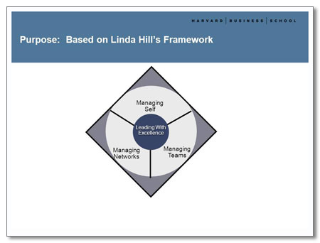
This month's slide makeover is from a deck I redesigned for Ellen Wingard of Ellen Wingard and Associates. She was leading a daylong workshop at the Harvard Business School and her presentation combined her own approach to management training with that of Linda Hill, a respected HBS … [Read more...] about September Slide Makeover of the Month
“Oh, you didn’t know that?”
How many times have you heard somebody say, "Oh, everybody knows that!" If you happen to belong to the lucky group that "knows that," you may smile and nod sagely. But if you're out of the loop it can make you feel foolish to hear these words. Something happened to me recently that clearly … [Read more...] about “Oh, you didn’t know that?”
August Slide Makeover of the Month
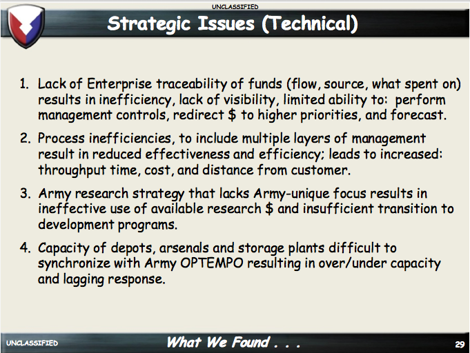
This month's slide makeover comes courtesy of the US Army. In this pair of slides, they list the main Strategic Issues that are impeding the smooth management of the Army Materiel Command. Before While this information is important, there's too much text. You'd go into this amount of detail in a … [Read more...] about August Slide Makeover of the Month
The Principals of Copyright
You may have noticed a potential misuse of the word "principal" in the headline of this blog. But it was no accident: the subject of this blog is the new principal of my sons' school. She gave a PowerPoint presentation that violated one of the main principles of the use of copyrighted images: you … [Read more...] about The Principals of Copyright
Army PowerPoint Rangers Shock, Awe with Comic Sans and Bad Design
I just found out about an unclassified Army PowerPoint presentation that really, really could use a lot of help. In fact, I do believe I'll include it in the Monthly Makeover section of my newsletter! This deck is composed in Comic Sans, the red-headed stepchild of the font world. The fact that … [Read more...] about Army PowerPoint Rangers Shock, Awe with Comic Sans and Bad Design
Free Photo Resources for PowerPoint
We all know by now that pictures can often help you to communicate better than words. And that people hate, hate, HATE text-heavy PowerPoint slides. So armed with that knowledge, you set out to transform your boring deck into a beautiful gallery of effective photography. But where do you go for … [Read more...] about Free Photo Resources for PowerPoint
A Picture’s Worth a Thousand Words
One of the chief gripes about PowerPoint presentations is "too much text on a slide." Great presenters use PowerPoint slides as a backdrop to their presentations, not the entire script. So they often include photos in their decks to illustrate major points. It's easy to see why. Here's a slide from … [Read more...] about A Picture’s Worth a Thousand Words

