After presenting my Cheating Death by PowerPoint workshop, I often ask people how they liked the animation. They usually answer "What animation?" Rather than feel discouraged that all that work I put into my deck went unnoticed, I'm overjoyed that the animation was so seamlessly integrated into the … [Read more...] about Animation in PowerPoint: too cool or too much?
You don’t need to number your PowerPoint slides. Discuss.
People often ask me to work with PowerPoint templates that include slide numbers. I can't imagine why slide numbers would be important. Maybe it makes presenters feel like they're accomplishing something if they glance at the screen and see that they're on slide 92, I don't know. But putting slide … [Read more...] about You don’t need to number your PowerPoint slides. Discuss.
November Slide Makeover of the Month
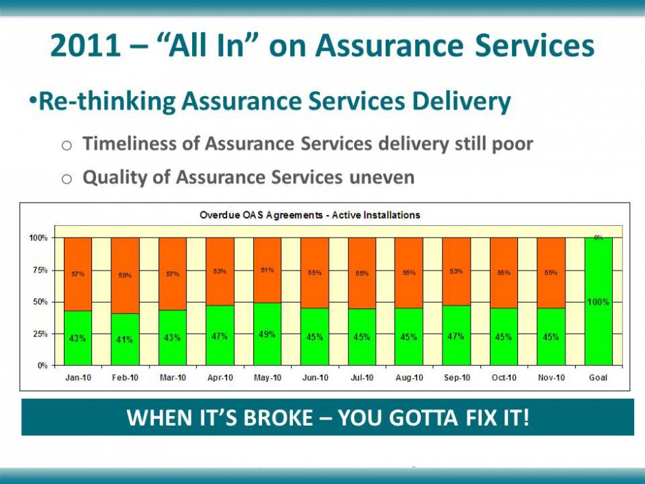
November's slide comes from a company that specializes in indoor environmental quality. The message of the slide was that they could make some definite improvements on the level of service they were providing to their customers. Before This slide has a lot of information on it; too much to absorb … [Read more...] about November Slide Makeover of the Month
October Slide Makeover of the Month
October's slide makeover is from a deck I found on SlideShare. There's a lot to do on this bad boy, so let's get started. Before Ever hear of the "Adkins" Diet? Neither had I. The person who created this slide misspelled "Atkins" four times! If your audience is focusing on your typos and not your … [Read more...] about October Slide Makeover of the Month
Should my logo be on each PowerPoint slide? No.
Now, I know you're probably thinking along one of these lines: "We paid a lot of money for that logo, and I want people to see it!" "I'm reinforcing my company's brand by showing my logo on each slide." "That's the way our template was designed." I would counter that if you start and end … [Read more...] about Should my logo be on each PowerPoint slide? No.
How much text on a slide is too much?
It's surprising how many presenters equate loads of text on a slide with effective information transfer. Some people believe that if they include every last scrap of data on the subject they're presenting that their audience will become as knowledgeable as they are. News flash: it doesn't … [Read more...] about How much text on a slide is too much?
What is the number-one PowerPoint annoyance?
If you think that a core dump and recitation of your entire store of knowledge on a particular subject makes for a captivating PowerPoint presentation, think again. According to a survey conducted by renowned PowerPoint expert Dave Paradi, a whopping 73.8% of the 603 respondents chose "The speaker … [Read more...] about What is the number-one PowerPoint annoyance?
Yeah, your kid’s cute. Now what?
Earlier this month I attended a seminar where I was exposed to many presenters and their various presentation styles. One presenter barely referred to his PowerPoint slides at all, instead relying on his dynamic personality and evangelical delivery style to get his message across. Most were seasoned … [Read more...] about Yeah, your kid’s cute. Now what?


