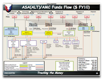
 I just found out about an unclassified Army PowerPoint presentation that really, really could use a lot of help. In fact, I do believe I’ll include it in the Monthly Makeover section of my newsletter!
This deck is composed in Comic Sans, the red-headed stepchild of the font world. The fact that this typeface is used in a presentation that was being given by the Secretary of the Army just blows my mind. What part of “Comic” escaped the designer?
The presentation is firing on all cylinders: slides packed densely with type, extensive use of primary colors, charts that hide information rather than clarify it, stage directions (“Introduce team…” “Slide builds while speaking”).
Author’s Note: Another review of this deck revealed the reason for the stage directions. All of the directions and most of the bulleted text are on so-called “Facer” slides which, one would hope, weren’t displayed during the actual presentation. I wonder why the PowerPoint ranger in charge of this deck didn’t put this stuff in the speaker notes.
To be fair, as someone who has worked for military clients I can tell you that it’s very difficult to convince the top brass that they shouldn’t include so much on their PowerPoint slides. In fact, among the main messages of this presentation are to pare back, do more with less, operate more efficiently, and embrace new technology. None of which, sadly, are being done in this very deck.
