Presenters often overlook a valuable opportunity to connect with their audience: their title slides. Title slides are usually displayed long before the start of a presentation and they can be be very effective billboards…if you design them well.
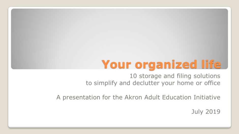
Before

ZZZZZZZZZZZZ…snork! Wha…what? I’m awake, I’m awake. I wasn’t sleeping!
Yes I was.
The title and subtitle are fine, but the second subtitle doesn’t tell the audience something they don’t already know. The layout is uninteresting and there’s no contact information for the presenter.
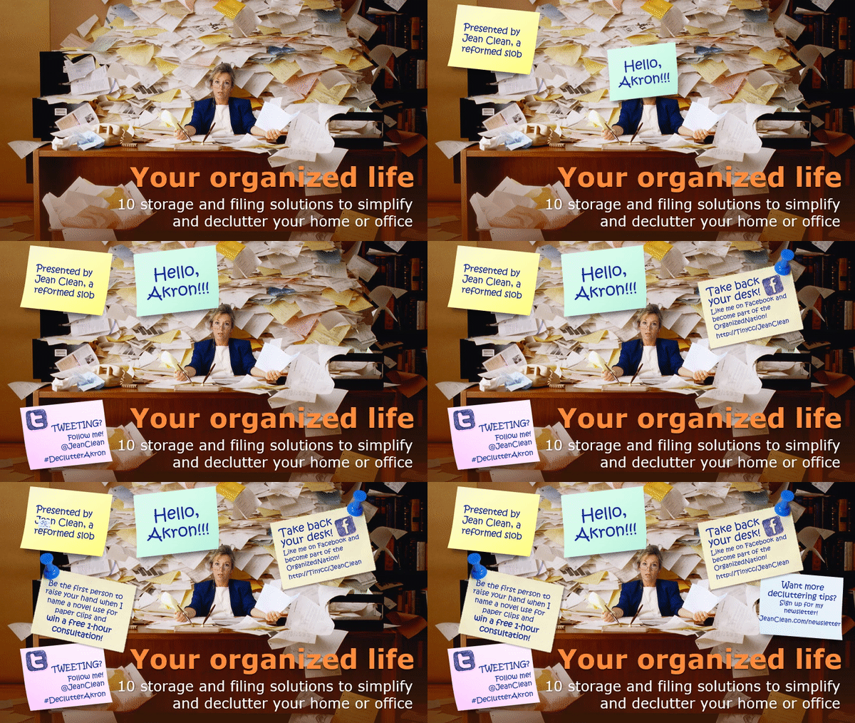
After

Now this title slide is working hard while the presenter gets ready and/or is schmoozing with the audience! There’s an amusing photo of a person who could use the speaker’s help, the speaker’s name and three-word bio, and four calls to action:
- “Like me on Facebook”
- Twitter handle and hashtag for event
- Newsletter signup
- Raise your hand to win a prize. This’ll keep people engaged with the presentation, because everybody likes winning free stuff!
I’ve sped up the animation for this demo. In real life, I’d wait longer between notes and leave the final frame up for longer so people can take down the information.
Download the PowerPoint file to see how the animation is done and to get those great Post-it®Note graphics!
Your turn
Have you gotten creative with your title slides? Let me know what you did to make your title slides work for you!
