One of the chief gripes about PowerPoint presentations is “too much text on a slide.” Great presenters use PowerPoint slides as a backdrop to their presentations, not the entire script. So they often include photos in their decks to illustrate major points. It’s easy to see why.
Here’s a slide from a presentation that addresses the fact that parents should supervise their children’s online activities more.
Does this information scare you? Does it make you uneasy? It should, especially if you have children. But chances are you’re just reading the text as bullet points and checking out the smooth background graphics. If I were presenting this deck, I’d want to make you uncomfortable about this information. So this is how I redesigned the slide:

How do you feel now? You can’t see what the girl is looking at, but you can tell that something’s happening on-screen. Is she scared? Has somebody said something inappropriate in a chat room? This image invites the viewer to speculate without having all of the facts, which is the whole point of the presentation.
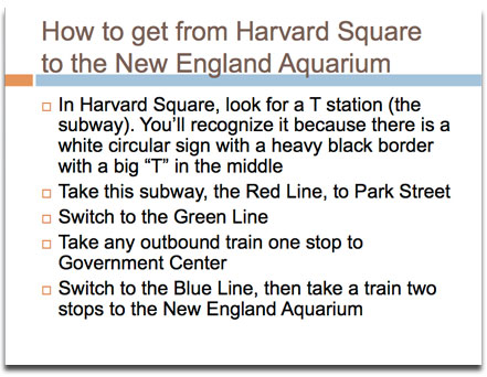
Here’s another example of using a picture instead of text. Would you rather follow these directions…
….or would it be easier to find your way around with this?
Maps contain a wealth of information that is readable at a glance.
So remember the old adage, “A picture’s worth a thousand words,” the next time you are creating a presentation. You might find that there’s a picture out there that communicates what you mean more effectively and elegantly than you could ever do using a bunch of bullet points.


