Happy New Year! It’s the time of year when we reflect upon what we’ve done with ourselves personally and professionally over the past year and resolve to become better people. Maybe there’s a new habit you want to develop (Exercise more! Drink less soda! Stop wearing fleece pants and slippers to the supermarket!) that will improve your personal life, and maybe there are some business practices you want to implement. If improving your PowerPoint game is among your New Year’s resolutions for 2014, here’s the top 5 countdown of things you can do:
#5 Be smart about color
Thankfully, most people now realize that the old standard of yellow text on a graduated dark blue background isn’t how we do things these days in PowerPoint. But there’s still room for improvement in the way a lot of people use color on their slides.
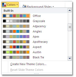
What colors should you use in your presentations? Well, the “Office” theme color is the default choice when you create a new, blank presentation. Although the colors work well together, they’re the colors that EVERYBODY ELSE is using. If you scroll down the list you’ll find many choices apart from the default. Better still, your theme colors should match what you’re using in all of your other marketing materials, such as your website, logo, brochures, etc.
Your PowerPoint presentations need to be be a strong part of your marketing mix. Brand your PowerPoint presentations with color by creating a custom theme color palette that matches what you’re already using in other media.
Most importantly, stick with the colors that are included in your theme color palette. If you introduce different colors, these may clash with what you’re already using. Remember, within a theme color palette there are 50 variations of the standard colors you can use.
#4 Don’t number your slides
Slides are not pages and they are not experienced in the same way as books and magazines. Slide numbering is distracting, takes up space, and serves absolutely no useful purpose. Not convinced? Read this article for four more reasons to stop numbering your slides.
#3 Stop cramming so much information onto each slide
If you’re paying for a printed advertisement in a magazine, it’s natural to want to use all of the space for your message. But when you’re designing slides, the more pictures, text, and graphics you stuff onto a slide, the less informative it is. Honestly.
Compare these two slides from a 2012 blog post:
Before
After
 The “before” slide has a lot of information that takes time to read and to absorb. And if your audience is doing that, then they’re not giving you their full attention. The “after” slide addresses one piece of data and shows it in a more dramatic way. Remember, people aren’t coming to your presentation to read, they have come to learn from you. And since we don’t have to pay for physical slides anymore (remember those days?), there is absolutely no need to stuff as much information onto as few slides as possible.
#2 Avoid complex tables
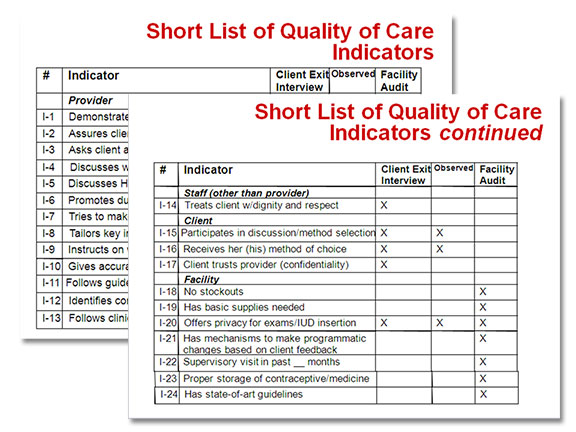
This is similar to Resolution #2, with a slight difference. The problem with complex tables isn’t just that there can be a lot of information on a slide that people need to read, it’s that tables make the audience do even more work. They need to read, compare, and draw conclusions from what they’ve read. Unless you’re teaching a course in critical thinking, you don’t want your audience to be spending the time it takes to analyze complicated tables. Here’s an example taken from a real deck:
What’s the main point here? Are some Quality of Care Indicators more important than others? Are they all followed? Who can tell? “Continued”?!?
And now, the number-one resolution you should make to improve your presentations is…
#1 Don’t read your slides to the audience
Time and time again, surveys have shown that the number-one annoyance for an audience is when the presenter reads from the slides. It’s an easy trap to slip into, especially when you’re asked to deliver a presentation on a subject you’re not familiar with. But when you read to the audience, you’re doing several things:
- You’re insulting people’s intelligence because you’re implying that they don’t know how to read.
- You’re wasting people’s time. If if they could simply read your presentation to understand it, then why should they see you in person?
- You make yourself look like you don’t know the material. If your audience senses that you can’t present without reading, they won’t trust that you know what you’re talking about.
Perhaps the biggest drawback is that when you’re reading your slides, you’re not reading your audience. Face-to-face contact is a precious commodity which shouldn’t be squandered by turning your back to the very people you’re trying to influence.
Your turn
What PowerPoint resolutions are you making for 2014, if any?


