 You’ve sweated out the details of your presentation. You’ve labored over your PowerPoint deck, writing, rewriting, and editing until your key messages shine through. You’re ready. But are you really?
Presenters often overlook a valuable opportunity to connect with their audience: their title slides.
Think about it. Your title slide is up there on the screen while you wait for the audience to arrive and find their seats. It might be onscreen while you’re being introduced by your host. Your title slides can be very effective billboards for you, but only if you design them well.
The most important elements of a title slide
Since title slides are usually on display for a while before a presentation, you want to make sure that they’re doing a good job of marketing you, your topic, and your company. Always include the following elements on your title slides:
- Title of presentation, with a subtitle if the presentation’s title is unclear
- Your name
- Contact information (email address, Twitter account, website, etc.)
- Company logo
Providing this information on the title slide tells the audience what they’re about to hear, who’s responsible for the presentation, and how to get in touch with you if they need to.
Simple title slides
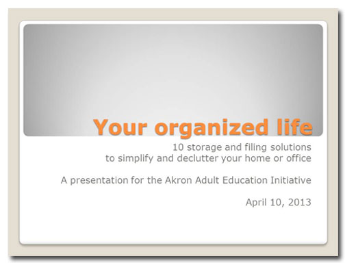
Let’s look at a typical title slide for a corporate presentation:
Argh.
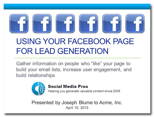
There are a number of things wrong with this slide:
- There is too much text on the slide and it’s all competing for our attention.
- The abundance of Facebook logos distract viewers from the logo of the presenter’s company.
- That subtitle looks more like a paragraph.
- You don’t have to point out the organization to which your audience belongs. The audience already knows what company they work for.
- You also don’t have to tell them what day it is.
Nice!
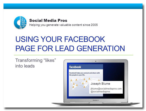
Here’s how I would redesign this slide while remaining true to the template:
- The multiple Facebook logos have been replaced by an image that appears to be on a computer screen. Because I chose the typographic Facebook logo, it doesn’t compete with the presenter’s company logo.
- The presenter’s name appears to be a window on a computer screen, and his email address and Twitter name have been provided.
- The company logo is now on the top of the slide, giving it the most importance.
- The subtitle has been shortened from 19 words to four.
Animated title slides
Sometimes your subject matter will lend itself to a more interesting approach to your title slides. Animating a title slide can be a great way to provide contact information, to invite people to subscribe to your blog or newsletter, or to introduce opportunities for audience participation. The animation reveals information a little at a time, creating anticipation and interest.
We begin with a plain, unimaginative title slide:
Wake me when it’s over
ZZZZZZZZZZZZ…snork! Wha…what? I’m awake, I’m awake. I wasn’t sleeping!
Yes I was.
The title and subtitle are fine, but, again, the remaining text doesn’t tell the audience something they don’t already know. And the layout is totally boring.
Now you’re talking!
Click on the video link below to see how the animations play on this title slide. I’ve sped up the animation for this demo, but if this slide were actually being used in a presentation I’d wait a couple of minutes between animations.
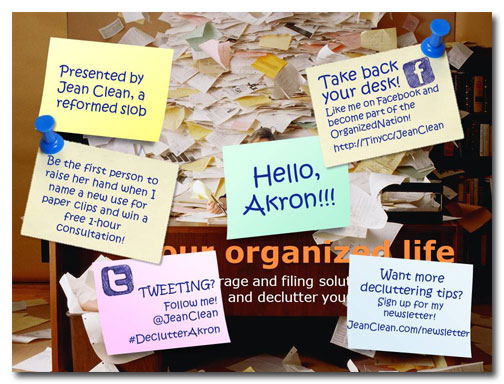
Presenting this information in the form of sticky notes is a good idea for this particular subject because they are used to organize thoughts and messages. They are often overused, being pasted on top of one another until their original purpose of organization is lost. Take a look at the image below, which is what the audience would see after the animations have played out.
This slide tells the audience who the presenter is, provides a personalized greeting, and includes four calls to action, including an opportunity for an audience member to win a prize. This last bit will keep people interested and engaged in the presentation, because everybody likes getting something for nothing!
Your turn
What are of your ideas for creating more interesting, informative title slides?

